There are different ways to visualize how a journal’s topics change over time. We are still working on different approaches to this, but the main approach seems to be to determine the overall topics within the entire print run and then reapplying that to the individual articles to see how well they fit. For a description of how these were produced, see our Workflow.
Area Graph
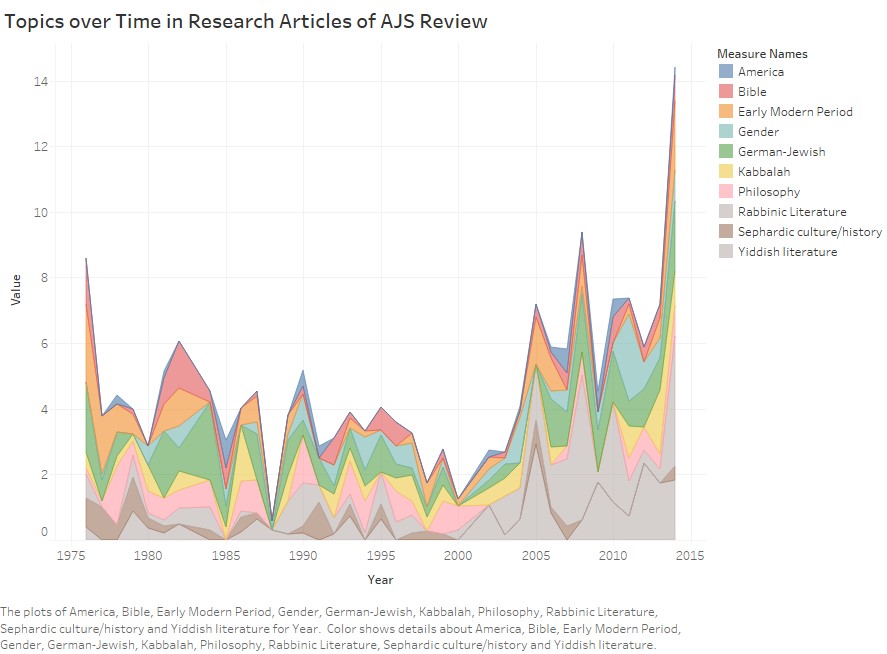
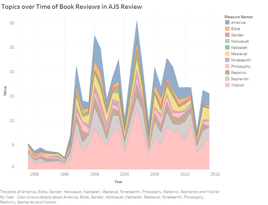
One way to visualize the results of this kind of analysis of AJS Review is a simple area graph. The two graphs, one for research articles and one for book reviews, are below. Note that the stacked areas are arranged, from top to bottom, alphabetically.
Interactive Visualizations
Research Articles
Book Reviews
Research questions relating to such data might be (1) the correspondence between the topics of the research articles and those of the book reviews; and (2) given that both are curated by the editors, whether one (and if so which) better represents the “state of the field.”
